Pop-ups, Voucher Codes, Countdown & Reward Points
Opinions about the use of pop-ups tend to be divided, some like them and some hate them. Pop-ups that have an added incentive get a better reception to those that don't, since why would you want to pass on your details to a company for little or nothing in return?
Why are pop-ups used? Mainly they are used to obtain a mailing list of customers that can be contacted for updates regarding the business. The updates can be newsletters that offer discounts, sales previews and other 'exclusive' offers, together with updates about the products or services available. Businesses hope that by engaging with the customer regularly with items such as newsletters, the customer will become loyal to the business and that they may even recommend the business to their friends and family.
Pop-ups usually take this form, however pop-ups can be seen attract the attention of their site viewers to other items such as:
- opinion polls, for example 'what is your opinion of X or Y?', this could help the business develop a better understanding of their customers' opinions. This is a useful tool for market research purposes.
- e-book, catalogue or piece of content download.
- to showcase a new product or product line, for example 'click here for a sneak peak of our Autumn collection'.
There are a number of things that need to be considered when designing a pop-up such as:
- The design, is it industry appropriate? Is it attractive?
- Branding, does it match the company's brand?
- The call-to-action, what do we want to achieve from the pop-up?
- How the pop-up appears: time-based, content-based, scroll-based or as a pop-out?
- Timing, how long is the optimum amount of time before introducing the pop-up?
- Where the pop-up is placed on the site, any particular pages?
- How often do we want the pop-up to appear to the site visitor, once or a number of times?
Some popups, especially those which contain scripts, might slow your page load time down which is a factor in conversions as well as SEO. Anything less than the right message at the right time can be annoying and distract visitors from their experience (Why You Should Be Using Popups on Your Online Store 2018).
Pictured below is an example of a light-box form pop-up, it is simple, it has a large call to action button visible and allows potential subscribers to view their terms of use, privacy policy and cookies policy.
(Babble | Entertainment, News, and Lifestyle for Moms 2018)
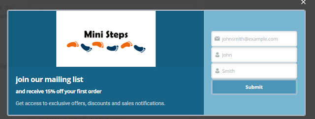
Pictured below is the pop-up that I designed using Hustle and this has been activated on the Mini Steps website. It can be viewed when the visitor to the site enters the Home page and the About Us page. To avoid the pop-up to becoming irritating, I kept the activation to these two pages only. The pop-up appears 3 seconds after the visitor has arrived at each of these page but in real practice I would set this time to 60 seconds. If your visitors have spent 60 seconds browsing your website, they have already shown an adequate amount of engagement and presumably they understand the main message of your site – and 60 seconds isn’t so much time that you lose a lot of potential subscribers (Zajdo 2018).
The screenshot below shows that the pop-up is fully functional as Hustle is storing details of the subscribers to the mailing list.
Hustle has been integrated with MailChimp so that the email addresses collected from the newsletter pop-up can be stored and used to send marketing campaigns created in MailChimp.
Pop-ups as already discussed, can be used in other ways such as advertising offers as seen below in on the Superdrug website.
(Superdrug | Beauty, Health, Skincare & Perfume)
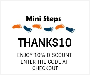
I designed a discount code pop-up, this pop-up is activated only when visitors enter the checkout. I made sure that the pop-up had the company logo and was recognisable so that visitors wouldn't mistake it as an advert from another company.
Countdown timers are used to alert customers to events or cut- off periods. Bustedtees are making their customers aware that the sale will end soon, seen pictured below.

(Brain Buster Enterprises 2018)
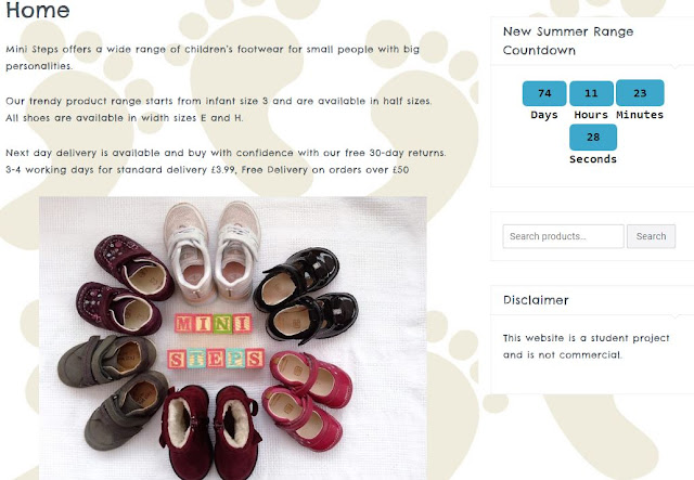
The key with countdown timers, as with the use of urgency in general, is that they offer useful information to customers – that a sale will end soon, or perhaps that they have an hour or two left to order if they want to receive items the next day(Charlton 2018). A countdown timer has been placed on the Mini Steps home page to count the time down to the new summer range product line. The timer would also be used during sales periods to encourage sales, if shoppers were a little undecided the urgency of the timer could persuade them to complete their purchases.
(Superdrug | Beauty, Health, Skincare & Perfume)
The joining incentive is 50 free points and a birthday treat, with this personalisation it can make the customer feel special and improve customer engagement.
(Superdrug | Beauty, Health, Skincare & Perfume)
I installed the Reward Points for Woocommerce plugin, as seen below.
I set the points conversion value as 10 points gained for every £1 spent and the reward redemption value was set as £1 for 250 points accumulated.
The screenshot below pictures the points reward awarded to an order of two sets of shoes. The total points rewarded can be seen highlighted in yellow, which is 580 points on an order value of £57.98. 580 points is the equivalent of £2.32 in terms of redemption in pounds.
The Reward Points for Woocommerce plugin allows business owners to view the details of the customers that have subscribed to the rewards programme; including their total shopping orders value, accumulated rewards points and equivalent redemption value, as pictured below.
REFERENCES
Brain Buster Enterprises, L. (2018) Breaking Bricks. [Online] Available from: https://www.bustedtees.com/t-shirt/breakingbricks [Accessed 16 April 2018].
Superdrug | Beauty, Health, Skincare & Perfume. [Online] Available from: https://www.superdrug.com/[.
Babble | Entertainment, News, and Lifestyle for Moms (2018). [Online] Available from: https://www.babble.com/ [Accessed 16 April 2018].
Why You Should Be Using Popups on Your Online Store (2018). [Online] Available from: https://www.shopify.co.uk/blog/16009092-why-you-should-be-using-popups-on-your-online-store [Accessed 25 April 2018]
Zajdo, C. (2018) Top 5 Popup Mistakes You Should Avoid. [Online] Available from: https://www.optimonk.com/blog/popup-mistakes/#.WuDxiYjwaM8 [Accessed 25 April 2018].
Charlton, G. (2018) How Countdown Timers Can Be Used to Drive Ecommerce Sales | SaleCycle Blog. [Online] Available from: https://blog.salecycle.com/strategies/countdown-timers-can-used-drive-ecommerce-sales/ [Accessed 25 April 2018].


Comments
Post a Comment